
Attribute evidence protocol
Creative Attribute Analysis: Which Findings Are Real
Count impressions and every creative tag comparison looks certain. Across 12,516 tagged creatives, 60% of those winners fail once you count creatives.

By Gregory Potemkin
Founder & CEO
Published
The sample size in a creative attribute report is the number of creatives, not the number of impressions. Not one tag-level report we reviewed publishes which of the two it uses, and the difference is not subtle. We ran the same comparisons both ways across 12,516 tagged creatives carrying $23.1 million of spend. Of the 469 comparisons where both tests apply, the impression test called all 469 significant. The creative-level test could not establish even the direction of the change for 282 of them, which is 60%.
What follows is the protocol that separates a row worth acting on from one that is an artifact of how the arithmetic was done, with the parameters Lemon AI runs in production and the analysis that motivated each one.
What a creative attribute table is
A creative attribute is a label describing something inside the ad rather than something about its delivery: the hook type, whether a voiceover is present, whether the footage is gameplay or user generated, how dense the on-screen text is, how many seconds long it runs. Label every creative in the library, group the performance rows by label, and you get an attribute table: one row per attribute value, each carrying a metric and a gap against the alternatives.
The promise is obvious and it is a good one. Individual creatives die every month, but the choice inside them that worked should transfer to the next brief. That is the whole reason to tag.
The problem is what happens between the table and the brief. Grouping rows by a label changes what the sample is, and no tag-level report we reviewed documents an adjustment for it. The rest of this page is that adjustment.
One thing this page will not do is name which attributes won. The results below come from client accounts, and an attribute taxonomy is part of how a studio competes. Every example is real and every example is stripped of the label, because the argument is about the arithmetic and the arithmetic does not care what the tag said.
Impressions are not the sample size
Every rate on a creative attribute table is a ratio of two summed measures. CTR is total clicks over total impressions. IPM is installs per thousand impressions. CPI is spend over installs. When something tests whether the gap between two attribute values is real, the obvious move is to treat the denominator as the count of observations: 8.5 million impressions on one side, 2.7 million on the other, two proportions, done.
That is the unit-of-analysis error. In our data it is the difference between a report where every comparison looks certain and one where three in five cannot name a direction.
Impressions are not independent draws. They are clustered inside a creative, and creatives are clustered inside campaigns and audiences. A million impressions of one video tell you about one video. Treating them as a million independent observations understates the variance by roughly 1 + (m - 1) times the correlation inside the cluster, where m is the impressions per creative. With m in the hundreds of thousands, even a correlation too small to notice inflates confidence past the point of meaning anything. The result is a confidence number that says “certain” every time, which is worse than having no confidence number at all, because somebody believes it.
Across 1,096 attribute comparisons in our clients’ accounts, 644 showed a lift of 20% or more on the point estimate. The impression test only applies to the 469 of those measured on CTR or IPM, where the rate genuinely is a proportion of impressions. CPI has no impression denominator, so it is tested one way only and sits outside this table. On the 469:
| Test | Comparisons calling the result real |
|---|---|
| Impressions as the sample size | 469 of 469 (100%) |
| The creative as the sample size | 187 of 469 (39.9%) |
The largest p value the impression test produced across all 469 comparisons was 6.4 x 10^-15. It never once said no. The creative-level test produced a real distribution: a first quartile of 0.006, a median of 0.088, and a maximum of 0.751.
282 comparisons, 60.1% of everything the naive test crowned, cannot establish which way the gap points. Not “the effect is smaller than it looks”. The sign is unknown.
Three months, 11 accounts, $23 million
The figures on this page come from Lemon AI client accounts, analyzed read-only on August 21, 2026. The method is stated in full so you can disagree with it.
| Parameter | Value |
|---|---|
| Window | May 1 to July 31, 2026, three complete months |
| Population | Every creative carrying an enum or boolean attribute with delivery in the window |
| Creatives | 12,516 |
| Spend | $23,078,494 |
| Impressions | 8,444,386,809 |
| Accounts | 11 |
| Attributes | 150 |
| Metrics | CTR, IPM, CPI |
| Comparisons | 1,096 |
Throughout this page the unit is the creative, which is the same object Lemon’s other guides call the asset: one file, one asset_id, the thing a network reports delivery against. Both sides of every comparison had to clear at least 3 creatives and $250 of spend. Individual creatives had to clear 1,000 impressions to count toward a CTR or IPM comparison, or $50 of delivered spend for CPI. Each attribute value was compared against the other values of the same attribute, never against the rest of the library. Numeric attributes were excluded, for reasons covered below.
The estimator is the one running in the product, not a reimplementation. Every statistic on this page was computed by the same module the insight feed calls, so these figures measure the protocol itself.
These are Lemon’s client accounts over one three-month window, not the market. Nothing here is a benchmark, and the survival rates on your own tables will differ.
The eleven accounts above are Lemon accounts, each of which can hold several ad network accounts. We re-ran everything a second time with every comparison confined to a single ad network account, which removes all pooling across networks and gives 104 narrower scopes and 3,239 comparisons. The answer moved in the harsher direction. Of the 1,301 comparisons testable both ways there, the impression test again called 100% significant and the creative-level test established direction for 35.2%. Of the 1,845 that cleared the 20% lift floor, 11.3% survived every gate against 21.1% in the pooled run. The two designs agree on the finding and disagree only on how much worse it is.
A finding that does not survive
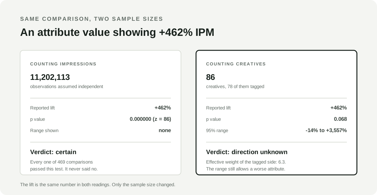
An attribute value showed +462% IPM against the other values of the same attribute. The tagged creatives ran at 4.18 installs per thousand impressions against 0.75 for the other values. It was carried by 78 creatives with $20,231 of spend behind them, against 8 creatives and $1,304 on the other side. On the impression test, with 8.5 million impressions against 2.7 million, the z statistic is 86 and the p value is too small to write down.
Now count creatives. The 95% range around that lift runs from -14% to +3,557%.
The range is not a technicality. It is the sample telling you it cannot rule out that this attribute is slightly worse than the alternatives. Commissioning a round of creatives against +462% and commissioning one against “we do not know” are different decisions, and the table showed only the first one.
What went wrong is not the lift calculation. The lift is correct. What is missing is that 78 creatives is not 78 units of evidence.
Thirty-four creatives can carry the weight of six
Spend and impressions inside a creative cohort are never distributed evenly. One creative takes most of the delivery, and the rest trail behind it. When that happens, the cohort’s effective sample size is far below its headline count.
Kish’s effective sample size, from Leslie Kish’s Survey Sampling (Wiley, 1965), makes this exact. For denominators x across the creatives in a cohort:
effective creatives = (sum of x)^2 / sum of x^2It equals the creative count when every creative carries equal weight, and collapses toward 1 as the weight concentrates on a few. In the +462% example above, 78 creatives carried the evidential weight of 6.3.
That case is not unusual. Across all 1,096 comparisons the median cohort held 34 creatives and the median effective weight was 6.1. Narrowing to the 88 cohorts that actually held between 30 and 40 creatives, the median effective weight was 5.5. As a share of raw creative count the quartiles were 0.13, 0.18, and 0.30, and 742 of the 1,096 cohorts carried less than a quarter of the weight their creative count implied.
The stricter within-network run is kinder and still damning: quartiles of 0.23, 0.43, and 0.73 on a median cohort of 11 creatives. Those figures describe these accounts over this window and are not a rate to expect elsewhere.
You do not need this number to compute an interval, because a correctly clustered interval already widens when weight concentrates. You need it to know whether to believe the count printed on the card. A row that says 78 creatives and carries the weight of six is making a promise the data cannot keep, and the count is the part a reader trusts.
You did not run one comparison. You ran 140.
A creative attribute report is not one test. It is every attribute crossed with every value crossed with every metric, ranked by effect size, with the biggest gap at the top. The row you are reading was selected on the same data that estimated it.
In those accounts the median number of comparisons available per account was 140, ranging from 18 to 282, and that is with only three metrics in play. A team slicing a dozen metrics runs several times as many. At the conventional 5% threshold, 140 independent comparisons produce seven spurious winners on average before any real effect exists at all. Then rank by effect size, which is what every one of these reports does. A false positive only reaches the top of that list if it is extreme, so ranking by size actively selects the noisiest rows and puts them where a reader looks first.
The remedy is false discovery rate control, introduced by Benjamini and Hochberg in 1995. It adjusts each p value for the size of the family it was drawn from, and it targets the proportion of false findings among the ones you act on rather than the probability of any error anywhere. That is the right target here, because a UA team is going to act on several rows, not exactly one.
One caveat belongs on the record, because this page is not entitled to skip it. The Benjamini-Hochberg guarantee holds when the tests are independent or positively dependent in a particular technical sense. Attribute comparisons are neither cleanly: the same creatives recur across attributes, and CTR, IPM, and CPI on one cohort move together. Under arbitrary dependence the strict guarantee needs the more conservative Benjamini-Yekutieli correction. We use Benjamini-Hochberg because the dependence here is overwhelmingly positive, which is the case it tolerates, and because the alternative is no correction at all. Read the correction as a large improvement over an uncorrected ranking rather than as an exact false-discovery guarantee.
Two rules matter more than the arithmetic.
Correct over the whole family, before ranking. The correction has to run over every comparison the data allowed, not over the handful that made the top of the list. Correcting the survivors is circular, because the survivors were chosen by the same effect sizes the correction exists to discount.
Do not let the reader lower it. The level is a property of the report, not a filter setting. A floor that moves after someone has seen the results is not a floor.
Of the 644 comparisons showing a 20% lift, this is what each gate removes:
| Gate | Surviving | Share |
|---|---|---|
| Showed a 20% lift on the point estimate | 644 | 100% |
| Interval excludes zero | 257 | 39.9% |
| Also survives false discovery rate control at 0.05 | 174 | 27.0% |
| Also keeps a 20% lift at the near end of the range | 136 | 21.1% |
One example of what the correction removes: a comparison showing +764% CTR on 12 creatives, with a 95% range from +54% to +4,734% and an uncorrected p of 0.017. Read alone it is a finding. Read as one of 101 comparisons on that account, its adjusted value is 0.073 and it is a coin that came up heads.
Judge the near end of the range, not the number in the middle
Once an interval excludes zero, there is still a decision to make about whether the effect is large enough to be worth a production cycle. The instinct is to compare the point estimate against a materiality threshold. That is the wrong end.
Both ends of a zero-excluding interval share a sign, so the end nearest zero is the smallest effect the sample is still consistent with. Test that one. Two rows can both sit far above your materiality bar and mean completely different things. The +764% row from the previous section, the one the correction killed, had a range starting at +54%. The row below has a point estimate of +129% and a range starting at +38%. On point estimates the first beats the second six to one. On what the samples actually support, the gap is 54 against 38. Most of that six-to-one was the sample talking.
Here is a comparison from our data that clears every gate. An attribute value ran at 3.25 installs per thousand impressions against 1.42 for the other values, a lift of +129%. It is carried by 156 creatives against 62, with $2.2 million of spend against $0.9 million. Those 156 creatives carry an effective weight of 20.6, which is 13% of the count and no better than the first quartile of this dataset. This row passes anyway, and publishing that number is the point: the gate is applied to the rows that survive it, not only to the rows it kills. The 95% range is +38% to +282%, and after correcting for the 282 comparisons available on that account the adjusted p value is 0.011.
That row is worth the price of a test. It is also worth noticing what the range does not do, which is get tight. The effect is somewhere between 1.4 times and 3.8 times the alternatives, a spread of nearly three, on 156 creatives and $2.2 million of spend. That is what a well-evidenced attribute finding looks like. A much narrower range on a tag table usually means the sample size was counted wrong.
Compare a value against its siblings, not against the library
Two choices upstream of any statistic decide what the number means.
Compare a value against the other values of the same attribute. If the cohort is “hook = gameplay”, the comparison is the other hooks, not every creative in the account. Comparing against everything else makes the claim about whatever those creatives happen to be, and untagged creatives are the worst offenders: they are outside the comparison entirely, because a creative with no value for the attribute is not evidence about any of its values.
Do not rank on totals. Ranking attribute values by summed clicks, installs, or spend ranks them by how many creatives carry each value. A cohort of 520 creatives out-clicks a cohort of 139 regardless of what is in either, and presenting the gap between them as a performance difference is arithmetic wearing an insight’s clothes. Totals are a real and useful thing to report, as contribution: how much of the account’s spend and outcome this cohort represents. They are not a comparison. If you want to compare on a volume metric, compare the mean per delivered creative and say so.
A number is a dose, not a category
A number is a dose, not a category. Video duration, text density, and scene count are measurements. Group by exact value and a library of 1,800 videos spread across 350 distinct second-counts becomes 350 cohorts of about five creatives each, every one below any sensible floor. That is how a numeric tag produces no findings at all while still being billed as a tag. Bin numeric attributes into quantile dose bands before any grouping happens, hold at least the floor in each band, and never cut in the middle of a run of identical values. Then every downstream mechanism works unchanged. We excluded numeric attributes from the analysis above rather than bin them inconsistently across accounts.
An eligibility floor can quietly select for success. Dropping weakly delivered creatives from a cohort is usually right, because an extreme rate measured on a token allocation is not evidence. But the floor has to sit on the opportunity, not the outcome. Qualify CPI on delivered spend rather than on installs, or every creative that took real money and produced nothing disappears from the sample and the attribute looks better than it was. Rate metrics qualify on whatever could have produced their outcome. Additive metrics take every delivered creative, because delivery is the outcome being measured and filtering on it would condition on the answer.
An immature outcome is not a small outcome. Comparing into a revenue window that has not closed manufactures a gap that closes on its own, and that failure is covered in full in the asset-level ROAS audit and the attribution window comparison. What is specific to attributes is where the damage lands: new creatives carry the newest attributes, so an immature window systematically penalizes whatever your team started making most recently. When cohort maturity metadata is missing, treat the window as immature rather than assuming it closed.
Only the creatives that disagree can settle it
A row on your tag table says creatives tagged X out-perform the rest. It stays silent about the fact that nearly every creative tagged X is also tagged Y, and the whole gap might belong to Y.
This has an exact answer rather than a judgment call, and it is worth adopting whatever tool you use. Given cohort A and candidate B, only the discordant cells carry information about which one owns the gap: creatives with A and not B, and creatives with B and not A. Everything in the overlap is common to both explanations and cannot separate them.
Which makes the threshold obvious. The cells that would separate the two attributes have to clear the same floors you require of any comparison you would publish. If the A-without-B evidence would not have been allowed to make a claim of its own, it cannot be used to award the gap to A over B either. One rule, applied twice.
A third check decides whether B is a candidate at all: B has to be present on enough of A’s cohort to be a possible explanation of it. Without that, two attributes tagged on completely different libraries have two empty discordant cells and get declared inseparable when in truth they never meet.
When two cohorts cover substantially the same creatives on the same metric, report one of them and disclose the other. Ranking both tells a reader the evidence is twice what it is. This is the check most tag tables skip entirely, and it is the one that decides whether you brief the hook or the format.
This adjusts for other tagged attributes only. Campaign, placement, audience, and calendar are confounders no tagging table can see. “Not explained by another attribute” is a much weaker claim than “causal”, and it is worth being careful not to spend the second where you have only earned the first.
What none of this establishes
Every gate above answers one question: is this gap distinguishable from sampling noise? None of them answers whether making more creatives like this would move the metric.
Nobody randomized which creative carries which attribute. The ad platform allocated delivery using signals your pipeline cannot see, so the attribute, the spend, and the outcome are all downstream of the same selection. On AppLovin we measured what that allocation does: across $32.4 million of spend, the highest-spending asset landed at the 50th percentile of D7 ROAS. The engine is not choosing at random and it is not choosing the best, and either way it chose, not you.
Three things follow that are easy to get wrong.
The interval shrinks with data. The confounding does not. At enough volume a clustered interval returns a very precise estimate of a biased quantity. Width is not correctness.
The creative is a conservative unit, not a sufficient one. Creatives inside one campaign share an audience and an auction, so the true cluster is coarser than the creative. Everything on this page is anti-conservative to the extent that creatives within a campaign correlate, which means the real survival rates are lower than the ones we published, not higher.
Rich observational data does not close the gap. Gordon, Zettelmeyer, Bhargava and Chapsky (Marketing Science, 2019) compared observational estimates against fifteen randomized advertising experiments at Facebook covering 500 million user-experiment observations and 1.6 billion ad impressions. Their finding was that observational methods “often fail to produce the same effects as the randomized experiments, even after conditioning on extensive demographic and behavioral variables”. That paper studies the lift from ad exposure rather than creative attributes, so it is an argument by analogy and not a direct measurement of this problem. The analogy holds on the part that matters: the selection you cannot observe does not become observable because the dataset got bigger.
Google is ahead of the tooling here, and it is the only platform we found that publishes anything like this. Google documents that asset-level ratio metrics including CTR, CPC, CPA and ROAS “should be used as directional indicators only” and “don’t accurately reflect the overall performance of a single asset in isolation, as these ratios are influenced by the combination of assets served together”, and recommends evaluating “at the asset group level or campaign level, rather than at the individual asset level”. That guidance covers App campaigns, Demand Gen, Performance Max, responsive display ads, and responsive search ads, verified August 21, 2026. Google also documents that asset metrics do not sum: if one ad impression includes three assets, all three register an impression.
Google is describing headlines and images that serve in combination inside one ad, which is not the same object as an attribute tagged across a library. The reason it transfers is that the attributes on one creative also always serve together, so a single attribute’s rate is never measured in isolation either. The largest advertising platform in the world publishes that caveat on its own element-level report. The creative tagging category, by and large, does not.
For contrast, Meta’s split testing, documented as of August 21, 2026, divides the audience into groups with no overlap and advises selecting only one variable per test. That is what buying a causal claim actually costs. An attribute table is not that, and no amount of statistical care converts it into one.
The honest summary is that this protocol tells you which patterns are worth the price of a test. It does not replace the test.
Twelve questions before a row changes what you make
Before an attribute row changes what you make next:
- Is the comparison against the other values of the same attribute, with untagged creatives excluded?
- Is it a rate or a per-creative mean, rather than a total that ranks cohort size?
- Do both sides clear a creative floor and a spend floor set before you looked?
- Did individual creatives qualify on opportunity rather than on outcome?
- If the metric has an outcome window, has every cohort in the range actually matured?
- Is the interval computed with the creative as the unit?
- Does the interval exclude zero?
- Does it survive correction for the full family of comparisons the report ran?
- Is the end of the range nearest zero still large enough to matter?
- Is the effective weight of the cohort close enough to its creative count to trust the count?
- Can any other tagged attribute explain the same gap on discordant cells that clear the same floors?
- Is the next step a test, rather than a budget move?
A row that clears all twelve is a hypothesis with evidence behind it. It is still a hypothesis.
How Lemon runs this
Lemon AI’s attribute analysis applies the measurement rules on this page by default, and publishes its parameters so you can argue with them. Deciding that the next step is a test rather than a budget move is still yours.
| Gate | Default |
|---|---|
| Minimum creatives per side | 3 |
| Minimum spend per side | $250 |
| Minimum lift to report | 20% |
| Creative eligibility, CTR and IPM | 1,000 impressions |
| Creative eligibility, click to install | 30 clicks |
| Creative eligibility, CPC and CPI | $50 delivered spend |
| False discovery rate for a strong verdict | 0.05, not adjustable by the caller |
| Default comparison window | 7 days, anchored on the last day with delivery |
Every one of those is a parameter, not a law. None was derived from the 12,516-creative analysis above; they are product policy, chosen so a claim shown to a paying customer clears a bar somebody can inspect and argue with. The floors are adjustable per request. The false discovery rate is not, and that is deliberate: anyone who can lower it can manufacture a strong verdict for any row, which is the exact failure the correction exists to prevent. Tune the floors to the variance in your own account, and record what you chose before you look at the results rather than after.
The interval is clustered on the creative, and it does not assume the two sides scatter by the same amount, because a cohort of 12 creatives and a cohort of 900 almost never do. The verdict is stated in words: strong evidence, limited evidence, or not conclusive. The range is labeled “95% range” and not “95% confident”, because the second is read as “95% chance this is right” by nearly everyone who is not a statistician. Comparisons suppressed by the floors are counted and reported rather than silently dropped, so a quiet feed is distinguishable from an empty one.
The one thing the product does not do is claim cause, and it says so on the surface rather than in a footnote. The methodology covers the reconstruction, provenance, and limitations behind the underlying creative metrics.
For the rest of the workflow: auditing an asset-level ROAS number before it moves a budget, measuring fatigue with the same kind of guarded comparison, and turning a diagnosis into the next controlled test.
Primary sources
- Google Ads: About asset-level metrics
- Google Ads: About campaign level asset reporting for responsive search ads
- Meta Marketing API: split testing
- A Comparison of Approaches to Advertising Measurement: Evidence from Big Field Experiments at Facebook
- Controlling the False Discovery Rate: A Practical and Powerful Approach to Multiple Testing