
Creative test reliability
How Much Spend a Creative Test Needs Before the Winner Holds
We ranked 1,224 creatives twice inside the same fortnight. The cost-per-install winners held. The D7 ROAS winners landed in the middle.

By Gregory Potemkin
Founder & CEO
Published
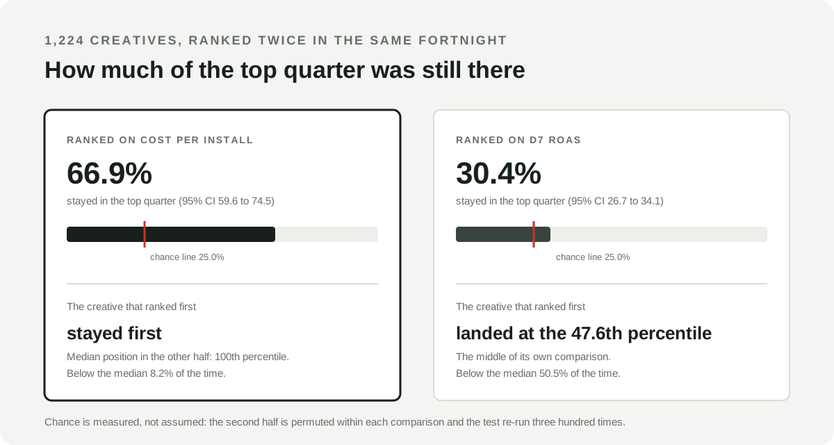
How much a creative test needs depends entirely on which column you are about to act on. We ranked the same 1,224 AppLovin creatives twice inside the same fortnight, across $31.6 million of spend between June and August 2026. Two thirds of the cost-per-install leaders were still leaders in the second reading. Under D7 ROAS, 30.4% survived, against a chance line of 25.0%.
That is the answer to “how much spend does a creative need before I can trust the winner”, and it is not a number. A week of ordinary delivery is enough to rank creatives on what they cost to acquire an install. The highest weekly budgets in our data, over $20,000 behind a single creative, still left the revenue ranking closer to a coin toss than to a decision.
The thresholds in circulation are answering a different question
Search for how much a creative needs and the numbers arrive quickly, and they agree with each other. A mobile game UA guide asks for a minimum of 50 conversions per creative in 4 days, or 100 conversions in 7 days, for a reliable read. A creative testing framework sets a minimum of 200 conversions, 100 per group, over a minimum test duration of five to seven days, calls a result significant when the “CPI difference > 2x confidence interval” at 95% confidence, and scales on “+15%+ CPI improvement, statistically significant”. RocketShip HQ’s creative testing calculator states the assumption underneath all of them: each creative needs enough spend to evaluate performance, approximately 2x your CPA per creative. All three accessed August 22, 2026, and none of them cites a dataset.
Every one of those is a sample-size rule for a randomized experiment. They answer the question “given two variants that received comparable exposure by design, how many observations do I need to detect a difference of size d”. That question has a clean answer, and none of it applies here, because on a self-optimizing network nobody randomized anything. The engine decided which creative spent your money, using signals your pipeline cannot see. Exposure is not comparable by design, it is the output of the decision you are trying to evaluate. We measured what that allocation does on AppLovin: across $32.4 million of spend, the highest-spending asset landed at the 50th percentile of D7 ROAS.
Google says the same thing about its own asset reporting, and it is the only platform we have found that publishes it. Asset-level ratio metrics including CTR, CPC, CPA and ROAS “should be used as directional indicators only” because they “don’t accurately reflect the overall performance of a single asset in isolation, as these ratios are influenced by the combination of assets served together”. Google recommends evaluating “at the asset group level or campaign level, rather than at the individual asset level”. That guidance covers App campaigns, Demand Gen, Performance Max, responsive display and responsive search ads, verified August 22, 2026.
So a power calculation is the wrong instrument. What a UA team actually needs to know is narrower and more useful: if I read this ranking again, on a different slice of the same delivery, does it say the same thing?
The test: rank the same creatives twice
Take one comparison scope: one ad network account, one app, one operating system, one fortnight. Rank every creative in it twice, once on each half of that fortnight. Then ask how many of the creatives in the top quarter of the first ranking are still in the top quarter of the second.
The fortnight can be cut in half two ways, and the difference between them is the whole point.
Sequential. Days 1 to 7 against days 8 to 14. This is what a UA team actually does: read last week’s table, act this week. Anything that moves between the halves counts, including real creative decay, audience shifts, and the engine reallocating.
Alternating. Odd days against even days. Both halves span the same fortnight, carry the same delivery regime, the same auction, the same audience saturation. Real change over time is largely cancelled. What is left is measurement noise.
If a ranking reproduces under alternating days but not under sequential weeks, something real changed between the weeks. If it fails both, the ranking never carried the information in the first place.
Three details make the comparison honest. The chance line is measured rather than assumed: within each scope the second half’s values are permuted and the whole test re-run three hundred times, which lands at 25.0 to 25.3% throughout. Ties are broken at random, and every figure below is the average over twenty-five tie-break draws. Confidence intervals come from a bootstrap over comparison scopes rather than over creatives, because creatives inside one app are not independent of each other.
What reproduced
The panel is 1,224 creatives across 3,741 creative-fortnight observations, in 32 app scopes across 5 Lemon accounts, over the four complete fortnights from June 17 to August 11, 2026: $31,602,258 of spend, $2,531,790 of D7 revenue, 1.65 billion impressions, and 16.6 million installs. A creative had to take at least $50 in each half of each split to be ranked, and a comparison had to hold at least five creatives. The median comparison held 17 creatives and the median creative took $329 in a week.
| Ranked on | Split | Creatives in the top quarter | Still there in the other half | 95% CI | Chance |
|---|---|---|---|---|---|
| D7 ROAS | week 1 to week 2 | 936 | 30.4% | 26.7 to 34.1% | 25.0% |
| D7 ROAS | alternating days | 936 | 34.1% | 30.5 to 37.8% | 25.1% |
| Cost per install | week 1 to week 2 | 829 | 66.9% | 59.6 to 74.5% | 25.1% |
| Cost per install | alternating days | 829 | 69.6% | 60.7 to 77.6% | 25.1% |
| Installs per mille | week 1 to week 2 | 936 | 61.6% | 56.9 to 67.4% | 25.1% |
| Installs per mille | alternating days | 936 | 67.6% | 62.3 to 73.4% | 25.2% |
The delivery-side rankings carry information. The revenue-side ranking sits close enough to the chance line that its lower confidence bound, 26.7%, is 1.7 points above pure noise.
The single-creative version is blunter. In each comparison, take the one creative that ranked first and find where it lands in the other half.
| Ranked on | Comparisons | Median percentile in the other half | Still in the top quarter | Below the median |
|---|---|---|---|---|
| Cost per install | 98 | 100.0 | 86.7% | 8.2% |
| Installs per mille | 106 | 100.0 | 89.7% | 5.7% |
| D7 ROAS | 106 | 47.6 | 28.6% | 50.5% |
The cheapest creative to acquire an install stays the cheapest. The best creative on D7 ROAS lands in the middle of the pack, and half the time it lands in the bottom half.
That number deserves reading next to the AppLovin allocation result. The engine’s biggest spender sits at the 50th percentile of return. Your own D7 ROAS pick sits at the 47.6th. Those are different cuts of the data, over different windows and different comparison scopes, so treat the pairing as a resemblance rather than a matched contest. The resemblance is still the point: on a revenue column at this grain, neither the engine’s choice nor yours is choosing on much.
It is not fatigue, and it is not the week changing
The obvious objection is that the second week is a different week. Creatives wear out, audiences saturate, the engine reallocates, so of course last week’s winner is not this week’s winner. That objection is testable, and the alternating split tests it.
D7 ROAS reproduces at 30.4% across adjacent weeks and 34.1% across alternating days of the same fortnight. Removing every source of change over time bought 3.7 points. Cost per install went from 66.9% to 69.6%, a gain of 2.7 points on the same manipulation. The time gap is not what is breaking the revenue ranking. The revenue ranking was already broken inside a single week.
One artifact could manufacture that result, and it is worth ruling out explicitly. Spend is recorded against the delivery date and D7 revenue against the install-cohort date, so a one-day lag between an impression and an install would push cost and revenue into opposite halves. Alternating single days is exactly where that damage would be worst. So we varied the length of each alternating run inside a 12-day block, from one day up to six, at which point the two halves are simply consecutive.
| Days per alternating run | Observations | D7 ROAS survival | 95% CI | Cost per install survival | 95% CI |
|---|---|---|---|---|---|
| 1 | 4,893 | 33.0% | 30.4 to 36.1% | 63.5% | 57.8 to 70.2% |
| 2 | 4,663 | 33.8% | 31.0 to 37.0% | 63.5% | 57.3 to 70.1% |
| 3 | 4,462 | 32.1% | 28.2 to 36.3% | 61.7% | 55.8 to 68.0% |
| 6, the halves are consecutive | 3,750 | 33.1% | 29.7 to 36.8% | 58.9% | 54.3 to 64.6% |
D7 ROAS does not move. If date misalignment were driving the instability, the top row would be the worst and it is not. Cost per install does move, downward, exactly as it should: the more calendar separation between the halves, the more genuine change accumulates. The two metrics respond to the manipulation in different ways, and only one of them behaves like a measurement of something.
What a week of delivery actually buys
The mechanism is not subtle once you count the events instead of the dollars.
Across the 29 of 32 app scopes that report purchase counts, in 3,568 creative-weeks, 45.4% recorded zero D7 purchases and 76.3% recorded fewer than ten. The median creative-week carried 1.4.
The same median creative-week is a three-step ladder: 11,248 impressions, 52 installs, 1.4 D7 purchases, on $325 of spend. Every metric on the table is computed from one of those three numbers, and they are three orders of magnitude apart.
A creative that produced one purchase is not a small sample. It is a sample whose entire revenue figure is one person’s spending decision, and revenue in mobile games and apps is famously top heavy. Rank seventeen creatives on a column whose numerator is, for most of them, one or two purchases, and the ranking is mostly a ranking of which creative happened to catch a payer. Nothing about that is expected to reproduce. Rank the same seventeen on a column built from tens of thousands of impressions and fifty-odd installs and it reproduces two times in three. That is the whole difference between the two halves of this article.
Three fixes that do not work
Waiting for a later outcome window. The instinct is that D7 is more meaningful than D0, so it should be more stable. It is the opposite. Survival falls monotonically as the window lengthens, on the same creatives.
| Outcome window | Survival, week 1 to week 2 | 95% CI | Median purchases per creative-week |
|---|---|---|---|
| D0 ROAS | 36.0% | 31.5 to 40.4% | 0.4 |
| D1 ROAS | 35.4% | 30.7 to 39.9% | 0.6 |
| D3 ROAS | 32.8% | 28.4 to 36.9% | 0.8 |
| D7 ROAS | 30.3% | 26.9 to 33.9% | 1.1 |
The four windows have to be compared on one population, so this table uses the panel eligible under the sequential split alone, which is slightly wider than the matched panel above. That is why the D7 row reads 30.3% here and 30.4% there. Adjacent windows have overlapping intervals, so read the gradient rather than any single gap. More time adds events, but it adds heavier events, and the extra variance outruns the extra count. Maturity is necessary before a number means anything, and the asset-level ROAS audit covers why an immature window manufactures gaps that close on their own. Maturity is not the same as stability, and this table is what happens when you have the first and not the second.
Pooling four weeks instead of one. Ranking on 28 days at a $200 floor, with a median of $1,532 of spend and 5.8 D7 purchases per creative, D7 ROAS survives at 27.5% (95% CI 21.8 to 35.0%). Cost per install survives at 65.1%. Four times the window did not move the revenue ranking off the chance line.
Spending more per creative. The gradient is real but weak, and it runs out of sample exactly where it starts to matter.
| Spend in the ranking week | Creative-weeks | Spend | In the top quarter | Survival | 95% CI |
|---|---|---|---|---|---|
| under $250 | 1,601 | $658,573 | 386 | 27.5% | 22.4 to 32.6% |
| $250 to $1,000 | 1,076 | $1,276,122 | 288 | 29.2% | 23.0 to 34.6% |
| $1,000 to $5,000 | 629 | $2,851,099 | 152 | 35.5% | 26.5 to 45.3% |
| $5,000 to $20,000 | 287 | $6,606,321 | 69 | 29.4% | 15.7 to 44.8% |
| $20,000 or more | 148 | $20,210,144 | 41 | 49.9% | 28.6 to 69.0% |
At $20,000 a week on a single creative the ranking finally does better than a coin, at 49.9%, on the 41 creative-weeks that reached the top quarter at that budget, with an interval running from 28.6% to 69.0%. That is not a threshold anyone can plan against, and it is not a budget most teams will put behind an untested asset.
The delivery-side result is not confined to five accounts
The revenue panel is small because asset-grain post-install outcomes are. The delivery panel is not. Across every network in our production data, every complete fortnight from February 3, 2025 to August 17, 2026, the same test on 108,501 creative-fortnight observations, 16,375 creatives, 533 app scopes and 206 ad network accounts, covering $145,468,288 of spend, 72.5 billion impressions and 709 million installs:
| Ranked on | Creatives in the top quarter | Still there next fortnight | 95% CI | Chance |
|---|---|---|---|---|
| Installs per mille | 27,220 | 79.2% | 78.6 to 80.0% | 25.3% |
| Cost per install | 25,422 | 73.9% | 73.3 to 74.5% | 25.1% |
Read that as the reassuring half of the page. The metric a creative team can actually measure at asset grain, week to week, holds up.
What to do with next week’s test
Rank on the delivery-side metric and treat it as the creative decision. Cost per install and installs per mille (IPM) answer the question a creative test can answer: which asset persuades more people to install, per dollar and per impression. That ranking reproduces at ordinary volumes, and it is the one that should decide which creatives get more delivery and which brief gets written next.
Keep the revenue question, and move it up a level. Whether the users a creative brings are worth more is a real question with real money attached. It is answerable at campaign, country, or channel grain, where the purchase counts are in the hundreds or thousands, and it is what a D7 ROAS target set from your own mature cohorts is for. Set the target there, then require the creative ranking to hit the cost per install that target implies. Do not ask a creative-week to answer it.
Run this test on your own account before you trust any floor, including ours. It takes one query. Pick a fortnight, split it into odd and even days, rank your creatives on each half inside one app and one operating system, and count how many of the top quarter appear in both. Permute one half and re-run it a few hundred times to get your own chance line. If your survival rate sits near that line, the column you are ranking on is not carrying a decision, whatever its confidence interval says.
Set the floor from that curve, not from a blog. The floors in this analysis, $50 of spend per half and at least five creatives in a comparison, were chosen to keep the panel wide, not because they are correct for anyone. Your own reproduction curve, computed against your own volumes, is the only floor with evidence behind it. That is the same discipline the creative fatigue measurement protocol applies to decay thresholds and the attribute evidence protocol applies to tag comparisons: the guard structure transfers between accounts, the numbers do not.
What this does not establish
A reproducing ranking is not a causal one. Everything on this page measures whether a measurement repeats. It says nothing about whether making more creatives like the winner would move the metric, because the engine chose the delivery and that choice is invisible. Cost per install reproduces, and it still carries every selection effect the allocation introduced. Reproducibility is a floor a metric has to clear before the causal question is even worth asking, not a substitute for it.
These are five accounts on one network over eight weeks. The revenue panel is AppLovin only. It is the one network here with post-install cohort outcomes at asset grain in enough volume to rank against: Unity Ads reports the same windows on a fraction of a percent of the rows, and Google’s asset-level outcomes are bucketed by conversion lag rather than by install cohort, which is a different clock and not comparable. Those outcomes are reconstructed rather than reported, using the reconciliation rules published in full. An app with heavy early monetization, or a team running far fewer creatives at far higher spend each, will see different numbers. What we expect to transfer is the shape: an outcome column built on a handful of events per creative per week will not reproduce, and no reporting tool can create the events that are missing.
The creative is a coarse unit and possibly the wrong one. These comparisons rank individual assets. If the thing that carries user value is the concept rather than the file, then pooling several assets of one concept would raise the event count per unit and might make a revenue ranking reproduce. We cannot test that here because concept identity is not in this data. It is the obvious next measurement and we have not made it.
Both halves exclude creatives that stopped delivering. A creative had to take $50 in both halves to be ranked at all. Creatives the engine killed between the halves are not in these figures, which means the analysis describes the ranking among survivors.
Where Lemon fits
None of this needs Lemon. The test is an overlap count on data you already have, and the prescription is a choice about which column to act on.
What Lemon does is make the columns comparable in the first place. Creative Analytics puts the network’s reported delivery next to reconstructed installs, purchases, revenue and ROAS for the same asset, with reconstructed values kept visually distinct from network-reported ones so a reader can see which is which before deciding how hard to lean on it. That distinction is the reason this analysis was possible: the revenue column and the delivery column are labeled differently in the product because they are not equally trustworthy, and this page is a measurement of exactly how unequal they are.
For the wider discipline, start with mobile app creative analytics. For what a network’s asset report can and cannot prove when the engine allocated the budget, read creative testing on AppLovin.