
Creative reporting grain
Grouping Creatives by Concept Does Not Fix the Ranking
We ranked 18,948 AppLovin assets, then ranked the 8,251 creative sets they sit in, on the same days. Pooling left the D7 ROAS ranking where it was.

By Gregory Potemkin
Founder & CEO
Published
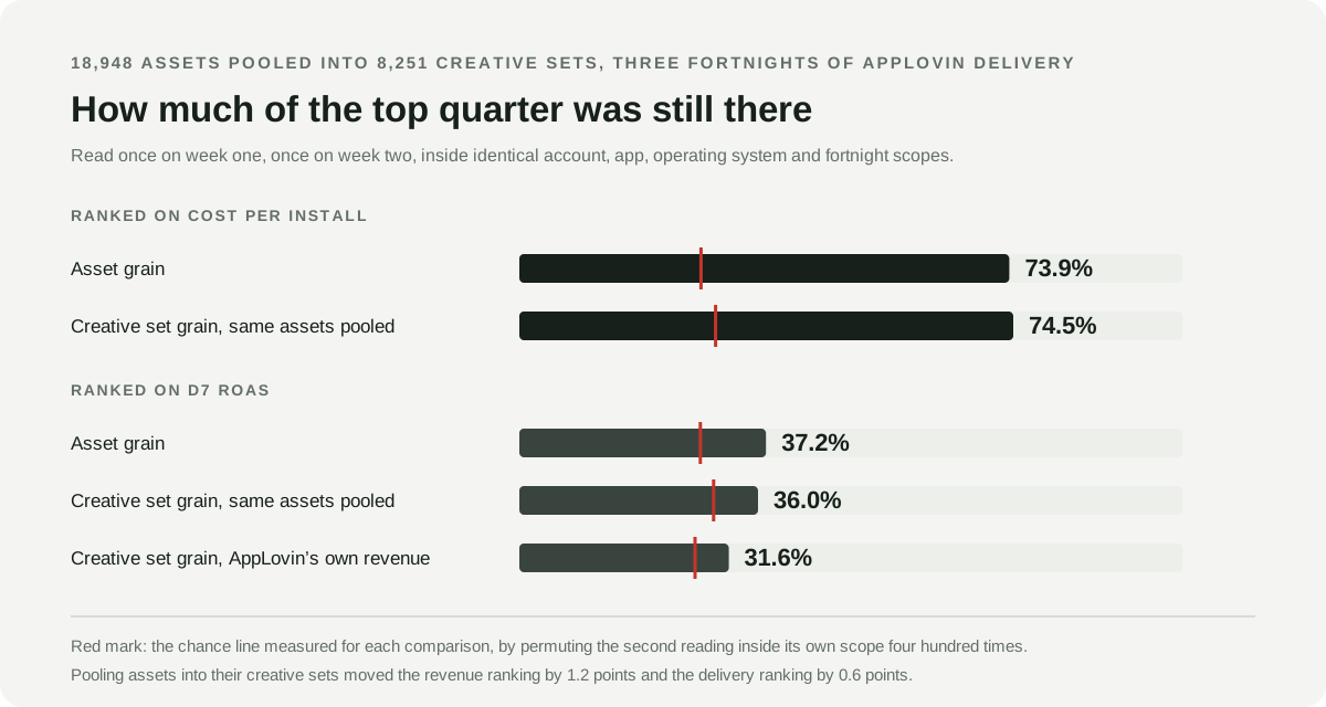
Pooling creatives into a coarser unit is sold as the cure for noisy creative reporting. It is not one. We ranked 18,948 AppLovin assets, then ranked the 8,251 creative sets those same assets sit in, on identical accounts, apps, operating systems and fortnights, and read every ranking twice. The cost per install ranking held both ways, 73.9% at asset grain and 74.5% at creative set grain. The D7 ROAS ranking held 37.2% at asset grain and 36.0% after pooling, against a measured chance line near 28%.
Pooling moved the revenue ranking by 1.2 points, and the wrong way. The advice predicts a large improvement. There is no improvement.
Everyone gives the same advice and nobody has measured it
The advice arrives from two directions at once, and it is the same advice.
The platform says the granular number does not exist. AppLovin’s guidance on analyzing campaign performance states that “Revenue, ROAS, and CPP are not available at the asset level. Those metrics are reported at the creative set level.” Its Asset Reporting API returns impressions, clicks, CTR and cost per asset and nothing else, which is why getting creative-level outcomes out of AppLovin takes more than one report. For asset comparisons AppLovin tells you to “filter down to that creative set in the Media Library and compare spend by asset”, on the reasoning that “more spend generally means the asset is part of more customer journeys that lead to purchases”. The creative set, in AppLovin’s own words, is where “consolidated performance reporting” lives. All verified August 22, 2026.
The tooling says the coarser unit is the better unit. A migration guide written for the creative sets change tells marketers to “focus on creative concept development rather than asset-level optimization” and reframes the exercise itself: “Instead of testing ‘which video wins,’ marketers should think ‘which concept pack delivers when the algorithm assembles it.’” Creative analytics vendors outside mobile reach for the same move and are more explicit about the payoff. Concept clustering, one of them writes, “prevents falsely killing winning ideas due to poor execution”. That is a claim about which unit gives you a verdict you will not have to take back.
Together they leave a UA team with one instruction and one measurable claim underneath it: judge at the creative set, because that is the table worth judging. We have not found anyone who tested the claim. So we did.
Why pooling sounds like it should work
The argument is intuitive and it is not stupid.
A single asset in a single week might carry $400 of spend and two purchases. An AppLovin creative set in this data holds a median of 2 assets and a mean of 3.8 on a given day, so four of those assets pooled into one set carry $1,600 and eight purchases. Ratios computed on eight events wobble less than ratios computed on two. Fewer rows, more evidence behind each row, a calmer table. Every analyst reflex says this should help.
It would help, if the missing ingredient were sample size per row. On a self-optimizing network it usually is not. The network decided how much each creative spent, and it decided using signals your reporting cannot see. That is why the delivery pattern itself is not a quality signal: across $32.4 million of AppLovin spend, the highest-spending asset landed at the 50th percentile of D7 ROAS. Pooling does not undo an allocation. It sums over it.
Google is the only platform we have found that publishes the caution explicitly. Its asset-level ratio metrics including CTR, CPC, CPA and ROAS “should be used as directional indicators only”, because they “don’t accurately reflect the overall performance of a single asset in isolation, as these ratios are influenced by the combination of assets served together”. That is an argument for climbing to the asset group or campaign, and it is worth noticing how far up it asks you to climb.
The test: read the same ranking twice, at two grains
The question a UA lead actually has is narrow. Last week’s table says this creative won. If I read the table again on a different slice of the same delivery, does it still say that?
So we took one comparison scope at a time, meaning one AppLovin account, one app, one operating system and one fortnight, and ranked the creatives in it twice. Once on each half of that fortnight. Then we counted how many of the top quarter in the first reading were still in the top quarter in the second.
The fortnight splits two ways, and the difference matters.
Sequential. Days 1 to 7 against days 8 to 14. This is what a team does in practice: read last week, act this week. Anything that moves counts, including genuine creative decay and the engine reallocating.
Interleaved. Odd days against even days. Both halves sit inside the same fortnight, the same auction, the same audience saturation. Real change over time is largely cancelled, so what survives is measurement noise. If a ranking fails under sequential weeks but holds under interleaved days, something real changed. If it fails both, the ranking never carried the information.
The whole test then runs twice more: once with each asset as a row, and once with the assets summed into the creative set they belong to. Same accounts, same apps, same operating systems, same fortnights, same underlying delivery. Only the unit changed. 133 scopes qualified at both grains under the sequential split, and 200 under the interleaved one.
The method is the one already published for the creative test reliability study, down to the $50 minimum spend per row per half and the minimum of five rows per scope, so the two studies are built the same way.
Three details keep the number honest. Ties are broken at random and every ranking is drawn 25 times and averaged, because most creatives earn nothing in a given week and a deterministic sort would put identical zeros in the same order in both halves and manufacture agreement. The chance line is measured rather than assumed at 25%: the second reading is permuted inside each scope 400 times, which reproduces the exact shape of these comparisons. Intervals come from 1,000 bootstrap resamples of whole scopes.
The window is June 23 to August 3, 2026, three complete fortnights, ending on August 3 because cohorts installed after that do not yet have a complete seven days of revenue.
Pooling moved the revenue ranking by 1.2 points
Here is the matched comparison. Identical scopes, identical assets, identical days, June 23 to August 3, 2026.
| Ranking | Held in the top quarter | 95% interval | Measured chance |
|---|---|---|---|
| Cost per install, asset grain | 73.9% | 68.4 to 79.6 | 27.4% |
| Cost per install, creative set grain | 74.5% | 69.9 to 79.2 | 29.6% |
| D7 ROAS, asset grain | 37.2% | 33.5 to 40.7 | 27.3% |
| D7 ROAS, creative set grain | 36.0% | 32.5 to 39.8 | 29.3% |
The delivery ranking is stable at both grains and roughly 2.6 times chance. The revenue ranking is close to chance at both grains, and pooling made it slightly worse rather than better. The intervals overlap almost completely, so the honest reading is not “pooling hurts”. It is that pooling does nothing.
The interleaved split says the same thing and rules out the obvious excuse. If the sequential result were caused by creatives genuinely decaying between week one and week two, then comparing odd days with even days inside one fortnight should repair it. It does not: 33.1% at asset grain and 32.0% at creative set grain, against chance lines of 27.1% and 28.8%. The delivery ranking, tested the same way, rises to 81.6% and 82.1%. Nothing is wrong with the test. The revenue column simply is not carrying a stable ordering.
AppLovin’s own creative-set revenue does the same thing
There is a fair objection to everything above. Lemon reconstructs asset-level outcomes, because AppLovin does not report them. Pooling a reconstruction upward pools its errors upward too. Maybe the failure belongs to the reconstruction.
It does not, and there is a clean way to show it. AppLovin does report cohort revenue at creative set level, in its advertiser report with day-level cohort semantics. That number involves no Lemon estimation at all. Run exactly the same test on it, across 6,544 creative sets, 119 campaigns, 39 apps, 5 accounts and $5,058,741 of spend carrying $795,729 of D7 revenue.
| Ranking | Held in the top quarter | 95% interval | Measured chance |
|---|---|---|---|
| D7 ROAS, week against week | 31.6% | 27.3 to 36.0 | 26.5% |
| D7 ROAS, odd days against even | 31.7% | 27.2 to 36.1 | 26.4% |
| Cost per install, week against week | 65.7% | 63.3 to 68.1 | 27.2% |
| Cost per install, odd days against even | 70.4% | 68.2 to 72.8 | 27.0% |
The rank correlation between the two readings is +0.156 for the revenue column and +0.692 for the delivery column. A correlation of +0.156 between two readings of the same fortnight is what it looks like when a column is mostly noise. The platform’s own number, at the platform’s own recommended grain, sits 5 points above its own chance line while the delivery cost in the next column of the same table sits 38 points above its.
That closes the question of blame. Whatever is wrong is not in anyone’s estimation layer. It is in what seven days of allocated delivery can tell you about which creative earns more.
Pooling adds rows together, not evidence
The mechanism is visible once you look at where the revenue actually sits. Take the same 18,948 assets and pool them into their 8,251 creative sets, and watch what happens to the shape of the panel.
| Panel | Rows | Rows carrying half of all D7 revenue | Rows with no D7 revenue at all |
|---|---|---|---|
| The 18,948 assets | 18,948 | 30 (0.2%) | 79.8% |
| The same assets pooled into 8,251 creative sets | 8,251 | 12 (0.1%) | 82.7% |
| AppLovin’s own 6,544 creative sets | 6,544 | 59 (0.9%) | 37.5% |
Pooling halved the row count and left half the revenue on 12 rows instead of 30. The share of rows earning nothing at all went up rather than down, because merging a big earner with a set of quiet siblings makes one big row, not several medium ones.
That is the whole story. Aggregation raises the spend behind a row. It does not raise the number of independent outcome events in the comparison, because those events were already concentrated on a handful of units, and pooling concentrates them further. A ranking built on rare events stays a ranking built on rare events after you add the rows together.
The rarity is not an artifact of a low-monetizing panel. Blended D7 ROAS is 11.1% across the asset panel and 15.7% across AppLovin’s creative-set panel, so a creative earning back a tenth to a sixth of its cost inside a week is ordinary here. A purchase is simply a rare event that lands on one row rather than another.
The delivery ranking survives pooling for the same reason it held at asset grain. Installs are common. Every eligible row has hundreds or thousands of them, at either unit.
More spend, a longer horizon, and a longer window do not fix it
Three natural rescues, all tested, none of them works.
Spend more per row. We raised the minimum spend a row needs in both halves from $50 to $2,500. The delivery ranking sat between 65.7% and 68.5% at every floor. The revenue ranking sat at 31.6%, 31.7%, 30.6%, 34.7%, 31.5% and 40.6% as the floor climbed, and by the top of the sweep only 9 scopes survived and the interval on that last figure runs from 25.9% to 52.0%. There is no floor in this data at which the revenue ranking becomes usable, and there is no trend pointing at one further out.
Wait longer for the outcome. The cohort report carries revenue at day 0, 1, 3 and 7, so we can watch reproduction as the outcome horizon extends. It goes down, not up.
| Outcome horizon | Held in the top quarter | 95% interval | Measured chance |
|---|---|---|---|
| D0 revenue | 39.6% | 35.1 to 43.8 | 26.4% |
| D1 revenue | 34.7% | 30.9 to 38.2 | 26.4% |
| D3 revenue | 33.5% | 29.2 to 37.8 | 26.5% |
| D7 revenue | 31.6% | 27.3 to 36.0 | 26.5% |
The interleaved split produces the same slope, from 37.2% at D0 to 31.7% at D7, so this is not cohorts changing while you wait. Each additional day of the revenue window adds more variance to the ratio than it adds ordering information. Waiting a week to judge a creative on revenue makes the judgement worse than judging it on day zero, and day zero was already close to chance.
Read a longer window. We replaced the fortnight with a single 42-day block split into 21 days against 21 days. The AppLovin-reported creative set revenue ranking reproduced at 30.9%, interval 24.9 to 35.3, against a chance line of 26.1%. The delivery ranking held at 64.1%. Tripling the reading window changed nothing.
The two objections we tried to make work
“Your creative sets are not stable, so you compared different bundles.” This one would invalidate the whole test, so we measured it. Among the 10,287 creative set fortnights that spent more than $100 and appeared in both halves, 77.3% had exactly the same asset membership in both halves, rising to 91.5% when weighted by spend. The median overlap of membership between halves is 1.00, meaning identical. Fewer than half the assets carried over in 0.8% of cases. The median share of a set’s fortnight spend coming from assets that appeared in only one half is 0.0%, and the mean is 0.3%. The container holds still. It is not the problem.
“An asset can live in several creative sets, so your pooling is not a real grouping.” True, and worth stating plainly because it is a fact about how these accounts are built rather than a flaw in the test: 60.3% of assets appeared in more than one creative set during the window, and those assets carried 94.5% of asset spend. A typical asset sits in two sets. AppLovin’s own documentation notes that “the same creative set can power multiple campaigns”, and the reuse runs in both directions. In the main analysis each asset was assigned to the creative set that spent the most on it.
So we reran the comparison on the 7,248 assets that belong to exactly one creative set, where the pooling is a clean partition. The revenue ranking held at 42.1% at asset grain and 34.2% after pooling, against chance lines of 32.2% and 33.0%. That subset carries only $657,140 of spend across roughly 20 scopes and the intervals are wide, so we report it as a direction rather than a result. The direction is the same one.
One more check, in case the top quarter is simply too demanding a bar. Ask only whether a top-half creative stayed in the top half, where chance is about 50%. Cost per install returns 83.4%. D7 ROAS returns 58.0% at asset grain, 59.3% pooled into sets, and 56.7% on AppLovin’s own set revenue. Loosening the question does not change the answer.
Where a revenue ranking does start to hold
Coarser does eventually work. It just stops being a creative decision first.
Climb one more level, to the campaign, and the AppLovin-reported D7 ROAS ranking reproduces at 54.2% sequentially and 80.0% under the interleaved split, against chance lines near 31%. Read that carefully: the gap between the two splits is large, which says most of what moves a campaign’s ROAS between two adjacent weeks is real change rather than noise. That is exactly the property the creative-level ranking lacked. It also rests on 14 and 18 scopes and the sequential interval runs from 27.3% to 80.0%, so treat it as directional.
The useful part is the shape. Revenue rankings become readable somewhere between the creative set and the campaign, which is above the level where you choose which creative to make more of. Pooling to a concept does not get you there, because a concept is still a creative decision with the same handful of purchases behind it.
What to do with next week’s table
- Rank creatives on the delivery-side metric. Cost per install, or cost per whatever early action your app has plenty of. It reproduced between 64% and 82% in every configuration we tested, at both grains, in both splits, at every spend floor and over every window length. That is a ranking you can act on.
- Choose the grain for convenience, not for confidence. Asset or creative set, both reproduce about equally well on delivery cost and about equally badly on revenue. The rest of the reading discipline, meaning which column came from where and what each one can decide, sits in the wider guide to mobile app creative analytics. If your network reports revenue only at set level, as AppLovin now does, you have lost less than it feels like. If you were already at set level, do not expect the coarser table to be steadier.
- Do not promote a creative because its revenue column looks good this week. At the median scope, the single best creative set by D7 ROAS in one half of a fortnight landed at the 52.9th percentile of the other half. That is the middle of its own comparison.
- Use revenue where revenue is stable, and act on it there. Campaign-level ROAS carried a reproducible ordering in this data. Creative-level ROAS over a single week did not, at either grain.
- Run this check on your own account. It needs a spend column, an outcome column and dates. Split a fortnight two ways, rank each half, count how much of the top quarter survives, then permute one half a few hundred times to get your own chance line. If your own revenue ranking reproduces, act on it. Ours does not, and neither does AppLovin’s.
Concepts are still the right unit for a creative team. Knowing that the puzzle hook beat the near-miss hook is how a production pipeline gets pointed somewhere. That is a question about attributes across many creatives and many weeks, which is a different measurement with its own counting problem, and it is not answered by pooling this week’s rows and re-reading the same ratio.
What this measurement does not establish
- It covers AppLovin over three fortnights: 6 accounts and up to 167 apps on the delivery side, 5 accounts and 39 apps on the AppLovin-reported cohort revenue side. Other networks allocate differently and may behave differently.
- It says nothing about whether cost per install is the right objective for your business. It says a cost per install ranking is stable. Those are different claims, and the second one does not make a creative profitable.
- A ranking that reproduces is not a causal result. Reproducibility is a floor, not a proof.
- Cost is recorded on the delivery date and revenue on the install-cohort date, which is the standard cohort convention and not an exact same-user join.
- The campaign-grain and single-set findings rest on small scope counts and are reported as directions.
- The delivery figures here come from a narrower panel and a shorter window than the earlier reliability study, so its published percentages and these are not the same measurement. The conclusion each supports is the same one.
- None of these percentages is a benchmark. They describe these accounts in this window. The point is the method, which you can run on yours.
Where Lemon AI fits
Lemon AI reconstructs the creative-level outcomes networks do not report and keeps the reported ones beside them, so a UA team can see which column came from where before deciding what to trust. Creative Analytics is where that reconstruction lives, and the methodology states the definitions, provenance and limits behind every figure on this site.
The reason we run tests like this one is that the alternative is shipping a prettier version of a number nobody has checked. A coarser table looks calmer. Calm is not the same as correct, and the difference is measurable.